Nordic Design Standards in Visualization
Explore how Nordic design values shape architectural visualization—emphasizing clarity, restraint, and context for global relevance.
Date
Category
Writer
Introduction
Nordic architecture has long represented a commitment to functional beauty, site-specificity, and a strong human focus. From Alvar Aalto’s poetic modernism to contemporary Danish and Norwegian sustainable housing, the region’s architectural tradition balances minimalism with emotional resonance. These same qualities extend naturally into the domain of architectural visualization.
Nordic visualization is not just a stylistic preference—it is a strategic approach that reinforces design integrity. It reflects cultural attitudes toward space, nature, and the user experience. As digital tools and AI-driven workflows evolve rapidly, the consistency and discipline of Nordic visual standards offer a reassuring benchmark of clarity and trust. This article explores the core principles, technical choices, and narrative power behind the Nordic visualization style, and why it continues to influence visual storytelling globally.
Core Values: What Defines Nordic Visual Aesthetics?
At the heart of Nordic visual communication lies a set of deeply embedded cultural values. These values prioritize:
Simplicity over spectacle: Avoiding ornamental excess and focusing on what is essential
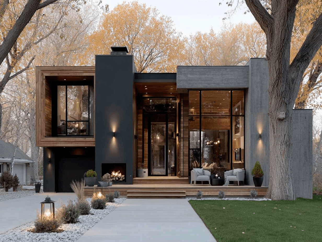
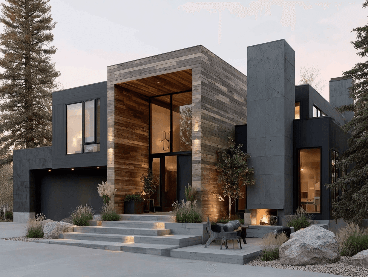
Natural light and honest materiality: Highlighting how daylight interacts with wood, stone, metal, and fabric in authentic, often overcast conditions
Contextual harmony: Embedding buildings within their environments—urban or rural—without visual domination
Functional clarity and flow: Clearly communicating how a space works and feels when inhabited
Nordic visualizations tend to avoid excessive dramatization or stylized effects. They aim instead to create renderings that feel quiet yet powerful, reflecting a design’s essence without unnecessary visual noise. This philosophy results in images that are calming, trustworthy, and easy to interpret.
Technical Execution: Scandinavian Precision and Restraint
Nordic visualizations are known for their precision—not just in geometry, but in light, texture, and tone. The aesthetic relies on consistency and rigor:
Lighting: Mimics natural daylight scenarios, often capturing diffused sky conditions typical of the Nordic climate. The goal is atmosphere, not theatrical contrast.
Materials: Textures are subtle and accurate, avoiding glossy finishes unless contextually required. The goal is to evoke the tactile qualities of real materials.
Color palettes: Tend toward desaturated, earthy, and muted tones. Interiors reflect hygge-inspired warmth—soft greys, blond woods, and linen whites—while exteriors prioritize balance with landscape.
Camera work: Angles are chosen to reflect the human experience. There’s little use of extreme wide-angles or exaggerated perspectives.
Together, these choices create visualizations that feel refined and honest. Even when produced through AI platforms or accelerated workflows, the output adheres to a carefully curated standard of quality and credibility.
Visual Storytelling with Restraint
Narrative is a key element in any visualization—but Nordic storytelling avoids sensationalism. Instead of crafting “hero shots” with perfect sunsets or hyperactive people, it tells stories through context and subtle cues:
Compositional rhythm: Using symmetry, negative space, and foreground-background layering to guide the eye naturally through the image.
Mood and atmosphere: Suggesting seasons, weather, or time of day through lighting and detail (e.g., rain on glass, footprints in snow, golden hour in late summer).
Objects with purpose: Furniture, bicycles, and books are placed thoughtfully—not for decoration, but to imply use and life.
Rather than staging drama, the rendering invites the viewer to imagine themselves in the space. It prompts reflection, not reaction. This sense of restraint also creates longevity—images feel timeless and less vulnerable to aesthetic trends.
Why Global Clients Value the Nordic Approach
The global success of Nordic visualization lies in its credibility and its alignment with contemporary design values. Across real estate, urban planning, and competition entries, this style is recognized for:
Trustworthy realism: It helps clients visualize the true feel of a space, reducing the gap between expectation and reality.
Strategic alignment with sustainability and wellness: As ESG considerations become mainstream, Nordic imagery quietly reinforces these principles without being didactic.
Translatability: The visual clarity and minimalism read well across cultures and languages—especially valuable for global developers.
Premium positioning: The understated refinement signals quality, attention to detail, and design literacy. For high-end projects, this builds confidence with both investors and end-users.
Many international clients—especially those in Northern Europe, Japan, Canada, and select parts of the US—actively seek out studios that can deliver this visual language. It conveys both artistry and professionalism.
Applying Nordic Standards in a Fast-Paced Industry
Maintaining Nordic standards in today’s fast-moving digital landscape requires intentionality. AI-assisted tools, 48-hour delivery cycles, and international collaboration can easily lead to visual shortcuts. But with careful planning, speed and restraint can coexist:
Use verified asset libraries: Nordic furniture, lighting, and materials are key to visual authenticity.
Establish lighting presets that mirror Nordic daylight: Avoid generic HDRI skies in favor of regionally inspired tones.
Train AI and rendering tools on region-specific references: Ensure that automation serves the design language rather than undermines it.
Communicate clearly with clients about expectations and scope: When time is tight, predefined visual parameters help preserve quality.
Studios that adopt these habits build not only efficient pipelines, but also reputations for visual consistency and integrity.
Beyond Aesthetic: Nordic Visualization as Strategic Communication
Ultimately, Nordic visualization is not just a matter of taste—it’s a form of strategic communication. The images don’t just show what the building will look like—they express its values. They set a tone, convey ambition, and foster trust.
In urban projects, they demonstrate how buildings will integrate respectfully into neighborhoods. In residential marketing, they reflect calm and comfort. In competitions, they project design intelligence without visual arrogance. And in global collaborations, they offer a common language of quality.
As visualization becomes more commoditized through generative tools and global outsourcing, Nordic standards offer something different: authenticity. They remind us that the purpose of visualization is not just to dazzle, but to inform, persuade, and inspire.
Conclusion: Less Noise, More Meaning
Nordic design standards in architectural visualization are a counterweight to a world of visual excess. They advocate for quiet confidence, contextual sensitivity, and narrative depth. By focusing on light, materiality, and clarity, this approach creates renderings that are not just beautiful—but believable.
In an age where fast is often mistaken for better, Nordic visualization proves that intention still matters. And as clients across the world look for meaningful stories, sustainable values, and timeless design, the calm authority of the Nordic visual voice will only grow louder.
Get inspired